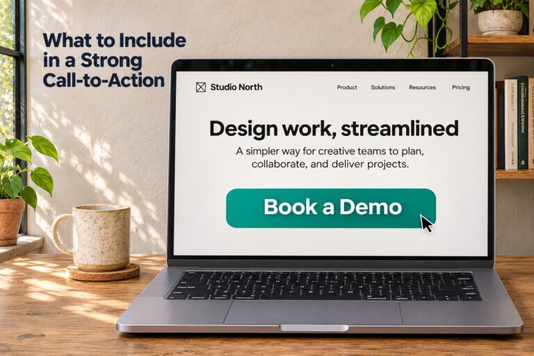
Knowing what to include in a strong call-to-action can turn a quiet web page into one that brings in leads and sales. A call-to-action, or CTA, is the button or link that tells visitors what to do next. Small changes to your CTA wording, color, and placement can change how many people click. This guide covers the parts of a good CTA and how to use each one on your website.
Clear and Simple Words
The words on your button matter more than most people think. Visitors should know what will happen the moment they read it.
Start With an Action Verb
Strong CTAs begin with a verb. Verbs tell people exactly what to do.
Good starter words include:
- Get
- Start
- Book
- Download
- Join
- Try
“Get Started” is easier to act on than “Information.” One tells people to move. The other does not.
Keep It Short
Most strong CTAs use two to five words. Long phrases slow people down. If your button text wraps onto two lines, it is probably too long.
A Clear Benefit
People click when they see what is in it for them. A good call-to-action shows the reward, not just the step.
Tell People What They Get
Compare these two buttons:
- Submit
- Get My Free Quote
The second one shows the value. The visitor knows they will get a quote, and that it is free. Words like “free,” “instant,” and “no cost” can help when they are true.
Be Specific
Vague words give people no reason to act. Specific words do. PartnerStack tested a homepage CTA change from “Book a Demo” to “Get Started.” According to <a href=”https://www.sender.net/blog/call-to-action-statistics”>call-to-action statistics from Sender</a>, this kind of button text change can lift conversions by over 100% in A/B tests. Results vary from site to site, so treat these numbers as ideas to test.
First-Person Wording
Writing your CTA from the visitor’s point of view can make the click feel like their own choice.
How “My” Can Beat “Your”
One well-known Unbounce test changed “Get your free template” to “Get my free template.” It lifted clicks by 90% on that page. HubSpot also reported that personalized CTAs converted 42% more visitors into leads than generic ones.
Examples of first-person CTAs:
- Start My Free Trial
- Show Me the Plan
- Send Me the Guide
When to Test It First
First-person wording does not win every time. In one reported test on a payment page, the “your” version performed worse than the “my” version. In formal or serious settings, “my” can also sound pushy. Run a simple A/B test before you change every button on your site.
Button Design That Gets Noticed
Even great words will not work if people cannot see the button. Design helps your CTA stand out.
Use Strong Color Contrast
Your button should look different from the page around it. A bright button on a bright page will blend in. There is no single best color. The best color is the one that stands out on your page and still fits your brand. Reports show that changing the button color alone can boost conversions by about 21%.
Make It the Right Size
A button that is too small gets missed. A button that is too big looks pushy. Aim for a size that is easy to read and easy to tap with a thumb on a phone.
Add White Space
Give your CTA room to breathe. Extra space around the button pulls the eye toward it. Crowded pages bury it.
Smart Placement on the Page
Where you put your CTA changes how often it gets seen and clicked.
Put It Where People Look
Place your main CTA near the top of the page so visitors see it right away. Then repeat it after your main details for people who keep scrolling. A roundup of CTA statistics from WiserNotify shares the same rule: put the main CTA on the first screen and repeat it lower down.
Here is how different CTA spots compare, based on data reported by Sender:
| CTA Location | Typical Click Rate |
|---|---|
| Feature boxes | 3% to 9% |
| Sidebars | 0.4% to 1.8% |
| Inline text links | 0.2% to 0.8% |
Feature boxes, which are clear and eye-catching blocks, clearly win.
Focus on One Main Action
Too many choices make people freeze. Pick one main goal for each page. For example, a service page might push “Request a Free Quote,” while a blog post might push “Download the Checklist.” You can still add a small second option, but keep the main CTA easy to spot.
Trust and Low Effort
People hesitate when a click feels risky or hard. A strong CTA lowers that worry.
Reduce the Risk
Short lines near your button can help. Phrases like “No credit card needed” or “Cancel anytime” answer common fears before they stop a click. Only use lines that are true for your business.
Keep the Next Step Easy
If your CTA leads to a form, keep the form short. Ask only for what you truly need. A name and email is often enough for a first step. Every extra field gives people one more reason to leave.
Quick Facts to Keep in Mind
Numbers can help you set goals and know when something is working.
CTA Statistics at a Glance
| Fact | Number |
|---|---|
| Median landing page conversion rate (Unbounce, 2024) | 6.6% |
| Lift from personalized CTAs over generic ones (HubSpot) | 42% |
| Higher click rate for email buttons vs. text-only links | 28% |
| Click lift from first-person wording in one famous test | 90% |
| Lift from changing button color alone (reported) | 21% |
These numbers come from different tests, so use them as a guide and not a promise. Your own results will depend on your audience, your offer, and your page.
Weak vs. Strong CTA Examples
| Weak CTA | Stronger CTA |
|---|---|
| Submit | Get My Free Quote |
| Click Here | Download the Checklist |
| Learn More | See Pricing Plans |
| Contact | Book My Free Call |
Test, Measure, and Improve
A strong call-to-action is rarely perfect on the first try. Testing shows you what your visitors respond to.
Change One Thing at a Time
Test the wording, color, or placement, but not all three at once. If you change everything, you will not know what caused the result. Run each test long enough to collect real data before you pick a winner.
Watch the Right Numbers
Track your click rate and your conversion rate. Click rate shows how many people press the button. Conversion rate shows how many finish the goal, like filling out a form or making a purchase.
A strong call-to-action uses clear words, a visible benefit, a button that stands out, and a spot where people will see it. Add a little trust, keep the next step easy, and test your changes over time. If you want help building pages that turn visitors into customers, the team at Parrot Branding designs websites and builds SEO strategies to help your calls-to-action get seen and clicked.