Using CSS clamp() for scalable typography gives designers a reliable way to create fluid, flexible, and readable type systems across a wide range of devices. The technique focuses on balancing minimum, preferred, and maximum font sizes so text adapts smoothly without breaking layouts. When implemented with intention, clamp() becomes a powerful tool for responsive design and performance focused styling.
Why Scalable Typography Matters in Real Projects
Scalable typography directly affects readability, user engagement, and visual hierarchy. Modern screens vary widely in width, density, and zoom behavior. Creating size rules that adapt to those variations prevents inconsistent line lengths, awkward text jumps, or oversized headings on compact devices.
High quality typography maintains rhythm and keeps content accessible. CSS clamp() simplifies this work by letting you define consistent rules without relying on complex media queries or long chains of breakpoints.
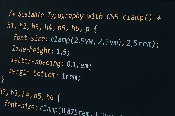
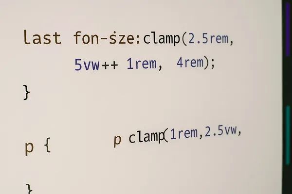
Building a Fluid Type Scale With CSS clamp()
Crafting a type scale with CSS clamp() strengthens visual consistency across headings, body text, and supporting elements.
Steps for Structuring a Type Scale
- Identify the minimum size required for readability.
- Choose a preferred fluid value (often a viewport unit) that supports responsive growth.
- Establish a maximum size that maintains balance on large displays.
- Apply the scale consistently across text elements such as h1 to h6, paragraphs, labels, and navigation.
Example Considerations for a Type Scale
- Larger headings should grow more noticeably than body text.
- Small text elements should scale modestly to protect legibility.
- Establish a mathematical ratio that stays consistent with brand or design guidelines.
Balancing Minimum and Maximum Values for Usability
Setting appropriate boundaries is a major part of using CSS clamp() for scalable typography. The minimum value should support clarity at small viewport widths, while the maximum value prevents oversized text on ultra wide screens.
Thoughtful boundaries reduce readability issues. Clamp values that are too aggressive may cause oversized mobile text or tiny desktop text. Designers benefit from testing their ranges across real devices to ensure the scale feels intentional and stable.
Enhancing Readability With Fluid Line Height and Spacing
Once typography scales smoothly, spacing should adapt as well. Line height, letter spacing, and margins influence how readable fluid text feels within its container.
Helpful Practices
- Use relative units for spacing where appropriate.
- Avoid fixed pixel spacing on elements expected to resize.
- Test multiline headings to prevent crowding at smaller sizes.
- Match line height to the growth of the text to protect vertical rhythm.
Using Clamp Values to Support Multiple Breakpoints Without Media Queries
One key advantage of CSS clamp() for scalable typography is the freedom from maintaining numerous media queries. By combining fixed and fluid units, clamp() logically transitions between sizes.
This approach keeps stylesheets lean, eliminates redundant breakpoint logic, and reduces the risk of uneven scaling between device sizes. Designers often replace entire blocks of responsive font rules with a single clamp() function that handles all cases elegantly.
Fine Tuning Typography for Branding and Visual Hierarchy
When implementing scalable type, branding should stay consistent. Clamp based typography helps maintain hierarchy at all viewport sizes, strengthening recognition and improving user flow.
Considerations for Hierarchy
- Headings should scale more dramatically to preserve their prominence.
- Secondary elements such as captions or labels should scale moderately.
- Font weight and letter spacing can enhance hierarchy without creating imbalance.
- Consistency in ratios across the type scale improves user comprehension.
Reducing Layout Shift With Predictable Scaling
Clamp based typography helps reduce layout shift by controlling how much elements grow as viewports expand. Layout shift can disrupt reading flow, especially on dynamic or content heavy pages.
Predictable scaling enhances stability. Designers gain more control over how text interacts with images, grids, and interactive components. When combined with responsive spacing systems, clamp() supports smooth transitions and less visual jitter.
Improving Performance Through Simplified Typography Logic
Cleaner code contributes to faster stylesheet parsing and better maintainability. Clamp requires fewer rules and eliminates dependency on multiple breakpoints dedicated only to typography.
Performance Benefits
- Reduced stylesheet weight.
- Fewer cascading conflicts between media queries.
- Faster prototyping and iteration cycles.
- More predictable typography behavior across browsers.
Practical Tips for Implementing CSS clamp() for Scalable Typography
Keep Values Logical
Maintain a natural progression between min, fluid, and max values. Unbalanced numbers create awkward jumps or sluggish scaling.
Test Across Device Sizes
Check behavior on actual mobile devices, tablets, large desktops, and high density displays. Visual comfort should remain consistent everywhere.
Use Responsive Units Strategically
Viewport units are powerful but can scale too dramatically if not controlled. Combine them thoughtfully with rem values for reliable responsiveness.
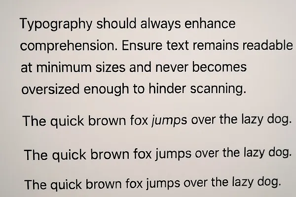
Maintain Accessibility Standards
Typography should always enhance comprehension. Ensure text remains readable at minimum sizes and never becomes oversized enough to hinder scanning.
Integrating Clamp Based Typography Into Existing Systems
Teams adopting clamp based typography can roll it out gradually. Start by updating a few heading levels or body text elements, then expand to global tokens or utility classes.
A Smooth Migration Strategy
- Convert top level headings first for immediate visual improvements.
- Replace conflicting media query rules with clamp equivalents.
- Create reusable CSS variables to store clamp values.
- Document the scale for future contributors.
Creating a Consistent Design Language Across Components
Scalable typography built with clamp() supports component based design systems. Whether using a traditional CSS architecture or frameworks like Tailwind or CSS Modules, clamp values can be stored as tokens, ensuring identical behavior across all parts of the UI.
This consistency improves UI predictability and reduces the chance of mismatched styles across teams or projects.
Common Mistakes When Using CSS clamp() for Scalable Typography

Overreliance on Viewport Units
Excessive fluid scaling can overwhelm users on extreme viewport sizes. Moderation prevents readability issues.
Forgetting Line Height Adjustments
If line height stays fixed while text grows, spacing may collapse or feel cramped.
Setting Identical Ranges for All Text
Elements serve different purposes. A heading requires a different scaling profile than body text or captions. Tailor clamp ranges based on meaning and context.
Ignoring Testing on Diverse Content
Real paragraphs, long headings, and UI labels may respond differently to fluid scaling. Test thoroughly to ensure compatibility.
When Clamp Based Typography Works Best
CSS clamp() offers the greatest benefit in designs with wide viewport ranges, such as marketing sites, editorial layouts, dashboards, and content heavy platforms. It supports flexible grids, fluid spacing, and designs that adapt in a controlled manner, ensuring better readability and visual coherence.
It also pairs well with variable fonts, modular scales, and modern design systems that need precise control with minimal code complexity.
Using CSS clamp() for scalable typography provides a dependable method for maintaining clarity and hierarchy across all devices. A well tuned clamp strategy ensures text remains visually consistent, user friendly, and aligned with responsive design goals. By refining boundaries, adjusting spacing, and optimizing scaling behavior, designers can build type systems that feel balanced, modern, and effortless to read.
Content reviewed and published by Parrot Branding Editorial Team.