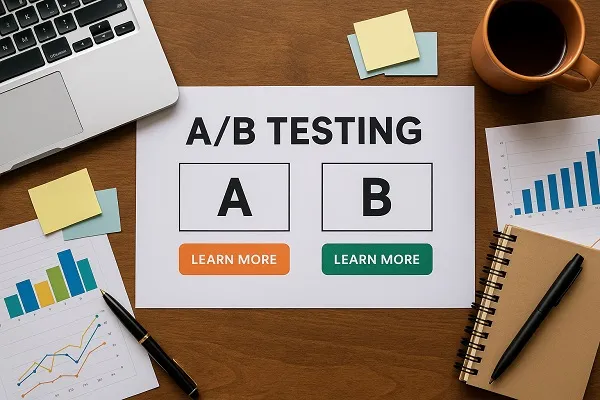
Simple A/B tests every business can run are often the difference between guessing what works and knowing what drives results. Whether you run an e-commerce shop, a service-based company, or a SaaS product, testing small changes can uncover powerful insights that directly improve conversions, sales, and customer engagement.
Below are some practical and impactful A/B test ideas you can implement quickly, without needing an advanced analytics team.
Headlines and Value Propositions
The headline is often the first thing visitors see. Small tweaks can significantly impact how people perceive your offer.
- Test short vs. long headlines to see if a concise pitch or a detailed statement resonates more.
- Try different value propositions — one highlighting price savings, another emphasizing quality, and another focusing on speed.
- Experiment with emotional vs. factual wording to learn what motivates your audience best.
Clear, attention-grabbing headlines often increase engagement before users even scroll.
Call-to-Action (CTA) Buttons
Your CTA button can make or break a conversion. Even subtle changes can boost click-through rates.
Ideas to test:
- Button color contrasts (green vs. orange, for example)
- Action-oriented text like “Get Started Now” vs. “Learn More”
- Button placement (above the fold vs. at the end of the page)
- Size and white space around the button
The key is making the CTA stand out without feeling pushy.
Product Descriptions and Copy
Words sell, and the way you frame your product matters. Testing variations can highlight what truly resonates with customers.
- Detailed vs. concise descriptions
- Bulleted benefits vs. narrative-style copy
- Highlighting features vs. outcomes
- Adding social proof within the copy
This type of test is especially important for e-commerce and SaaS businesses.
Images and Visuals

Visuals often drive emotional decision-making. By testing images, you can see what builds trust and generates interest.
Options to test:
- Lifestyle photos vs. product-only photos
- Stock imagery vs. custom photography
- People-focused images vs. object-focused images
- Static images vs. short videos
Visual elements can significantly alter perception and improve conversions.
Pricing Display Formats
Pricing is a sensitive but powerful element to test. The way you present pricing often affects conversions more than the number itself.
- Monthly vs. annual pricing emphasis
- Rounded numbers (e.g., $50) vs. psychological pricing (e.g., $49.99)
- Bundled pricing vs. single-product pricing
- Highlighting most popular or best value plans
Businesses often see measurable lifts from small tweaks in pricing presentation.
Email Subject Lines
Email marketing remains one of the most effective ways to nurture leads and drive sales. Testing subject lines can lead to higher open rates and engagement.
Examples to test:
- Personalized subject lines vs. generic ones
- Short and direct vs. longer and descriptive
- Urgency-based wording vs. curiosity-driven language
Higher open rates directly feed into stronger conversions from your campaigns.
Checkout or Signup Forms

Forms are often where conversions stall. Reducing friction here can lead to immediate wins.
Testing ideas:
- Number of required fields (short vs. long forms)
- One-page checkout vs. multi-step process
- Placement of trust badges or security seals
- Auto-fill options and progress indicators
These small adjustments can significantly reduce cart abandonment or signup drop-off rates.
Landing Page Layouts
The structure of your landing page influences how users move through it.
- Single-column vs. multi-column design
- Minimalist design vs. detailed feature breakdowns
- Including testimonials higher vs. lower on the page
- Using video introductions vs. static hero images
Page flow directly impacts whether visitors take action or bounce.
Navigation and Menu Options
Sometimes, simplifying user choices boosts conversions.
- Testing mega-menus vs. minimal navigation
- Highlighting fewer key categories vs. many options
- Placing the navigation bar at the top vs. side
Streamlined navigation can reduce decision fatigue and improve browsing time.
Social Proof Placement

Trust is critical for conversion. Where and how you showcase social proof can make a big difference.
- Testimonials at the top vs. near the CTA
- Case studies vs. customer reviews
- Featuring logos of well-known clients vs. ratings and stars
The right placement often increases trust at the perfect decision-making moment.
Timing of Offers and Pop-Ups
When you present an offer can affect how users respond.
- Pop-ups triggered immediately vs. after 30 seconds
- Exit-intent offers vs. mid-browse offers
- Discount presented on the homepage vs. at checkout
The timing test alone can reveal when your audience is most likely to act.
Businesses don’t need complex tools or huge budgets to benefit from A/B testing. By running simple, focused tests like changing headlines, CTAs, pricing displays, or form designs, you gain data-driven clarity on what moves your audience to act. The most successful companies don’t rely on assumptions — they let real results guide decision-making. Start with one or two of these A/B tests and build from there; even small wins compound into major growth.
Content reviewed and published by Parrot Branding Editorial Team.